

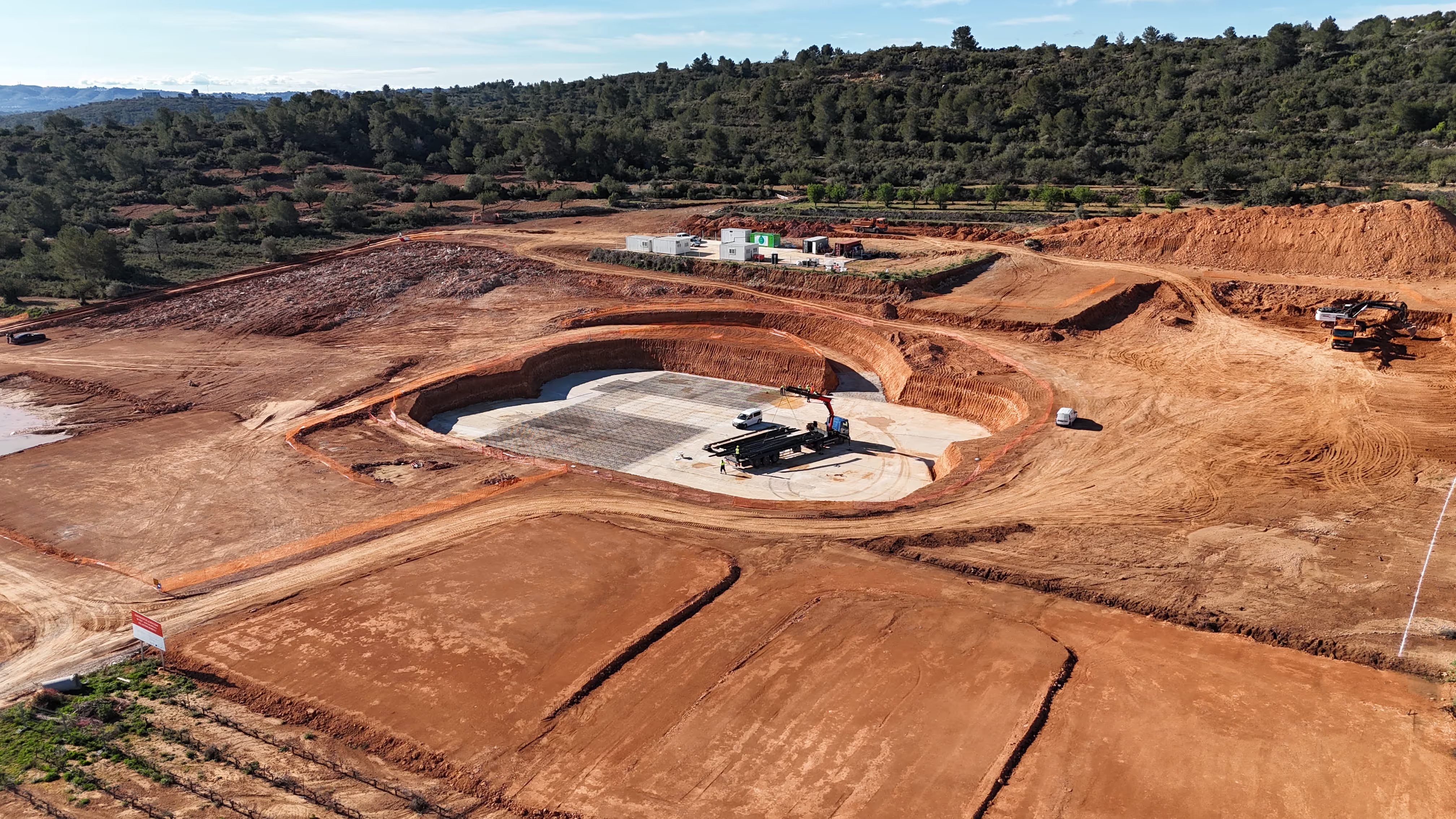
A brand as solid as concrete

For
industry
Construction
Branding
Graphic Design
Web Design
Audiovisual production
Brand Refresh
UX/UI
Approaching a generational handover and its 25th anniversary, Joarca y Dos chose us to refresh its identity and clearly communicate its national reach and ability to deliver.

We turned 25 years of expertise into an identity ready to compete nationwide.

Joarca y Dos did not need to invent a new story. It already had a strong track record, experience on demanding projects and a professional approach. The problem was that its visual identity did not fully communicate the company's scale, reliability and ambition.

Its 25th anniversary marked a turning point: a generational handover, a more national outlook and the need for a recognisable, memorable brand ready to work with major construction companies.

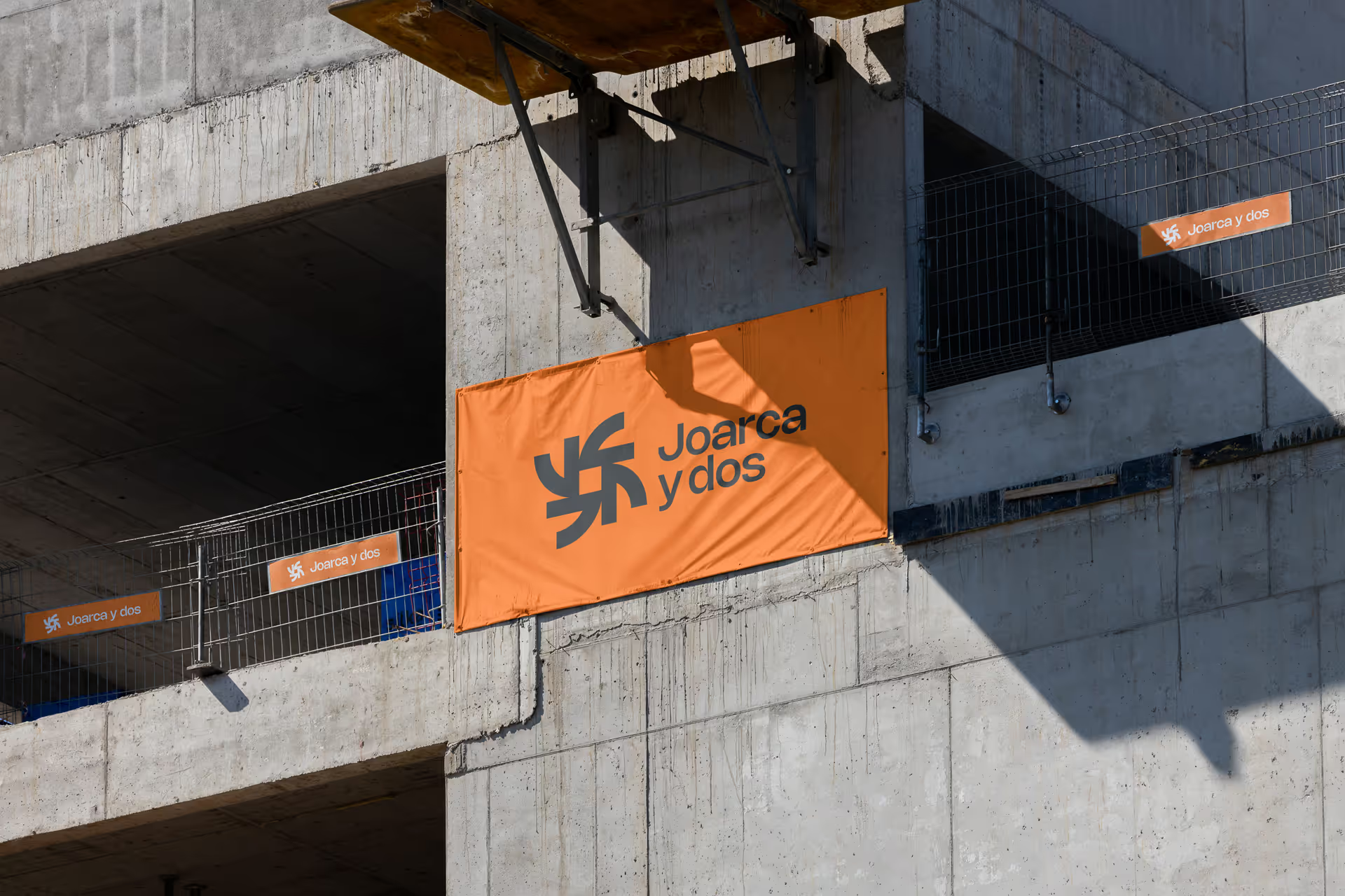
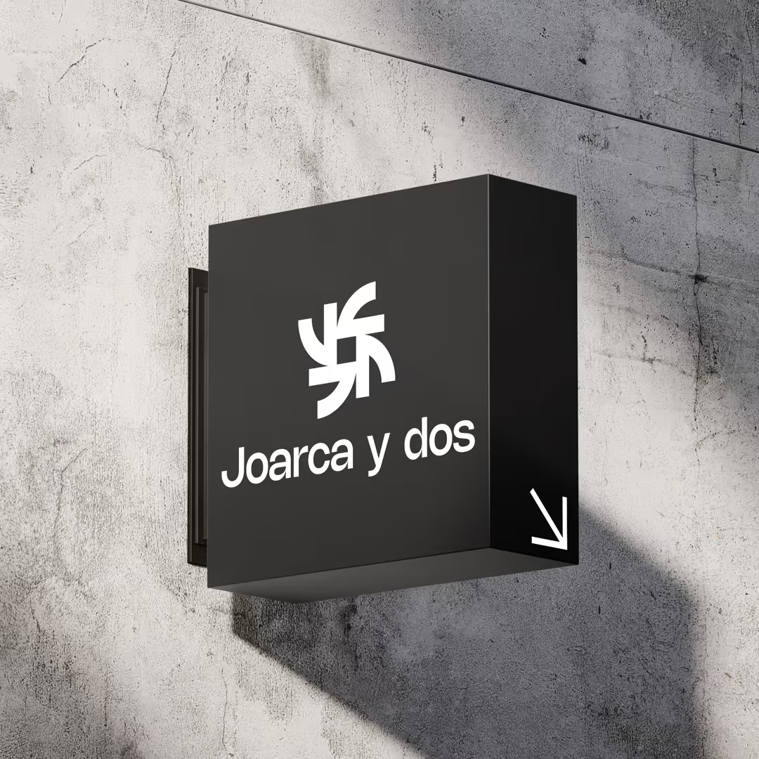
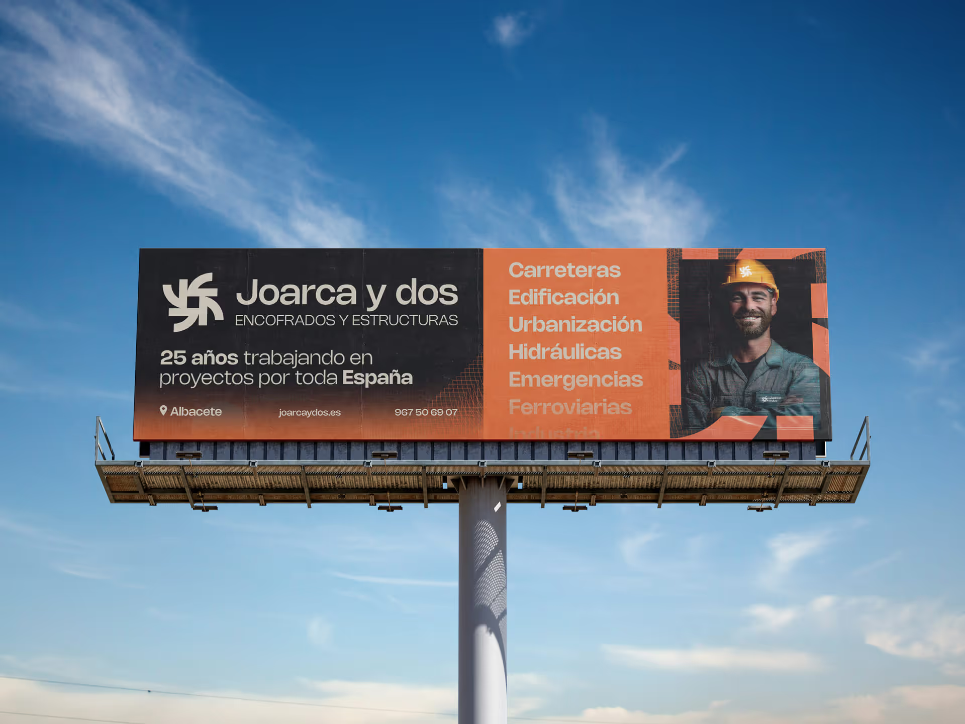
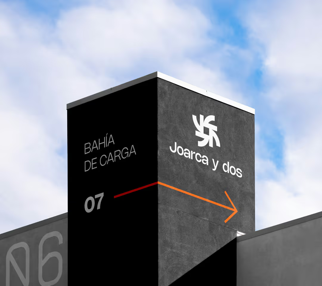
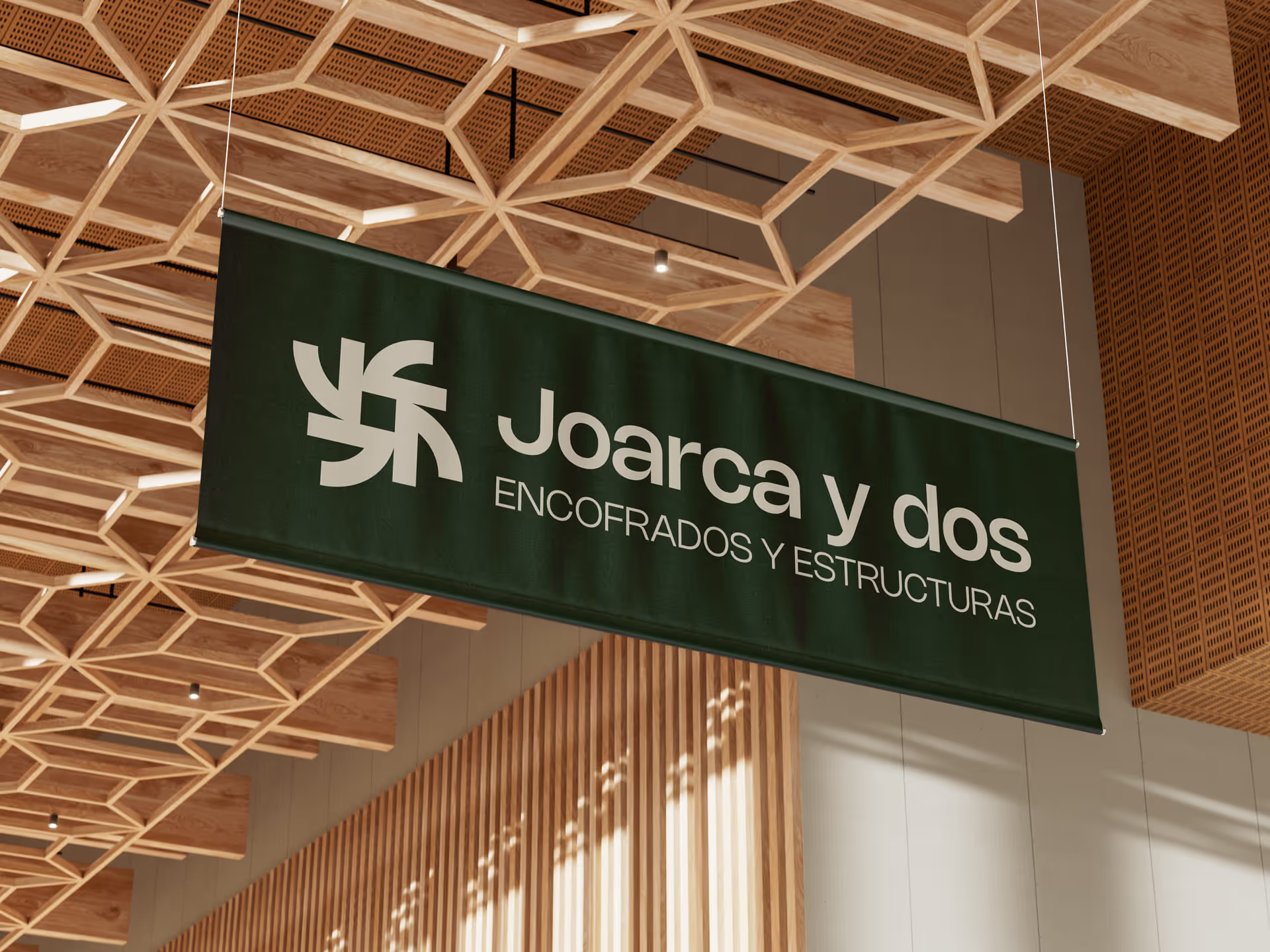
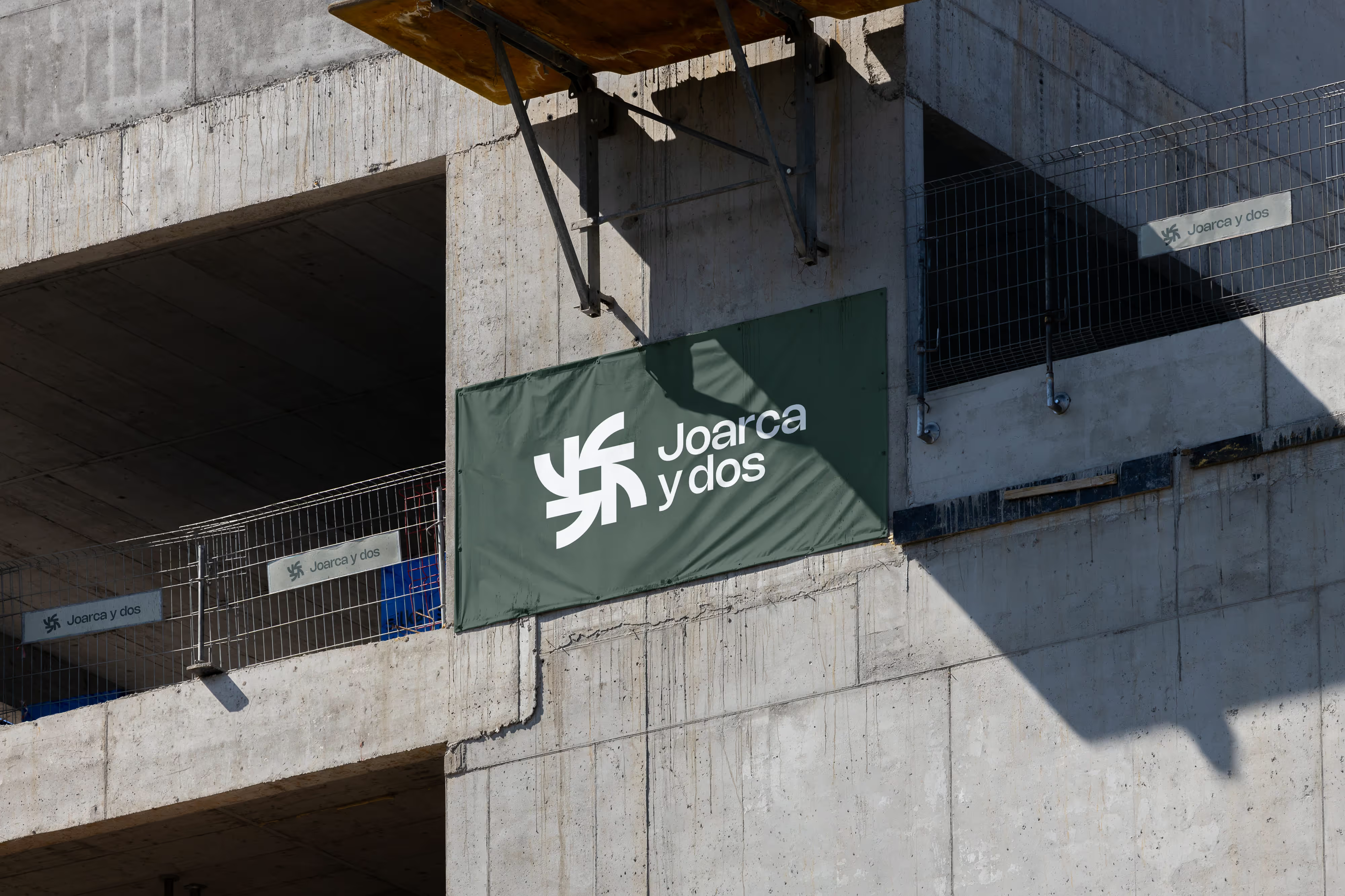
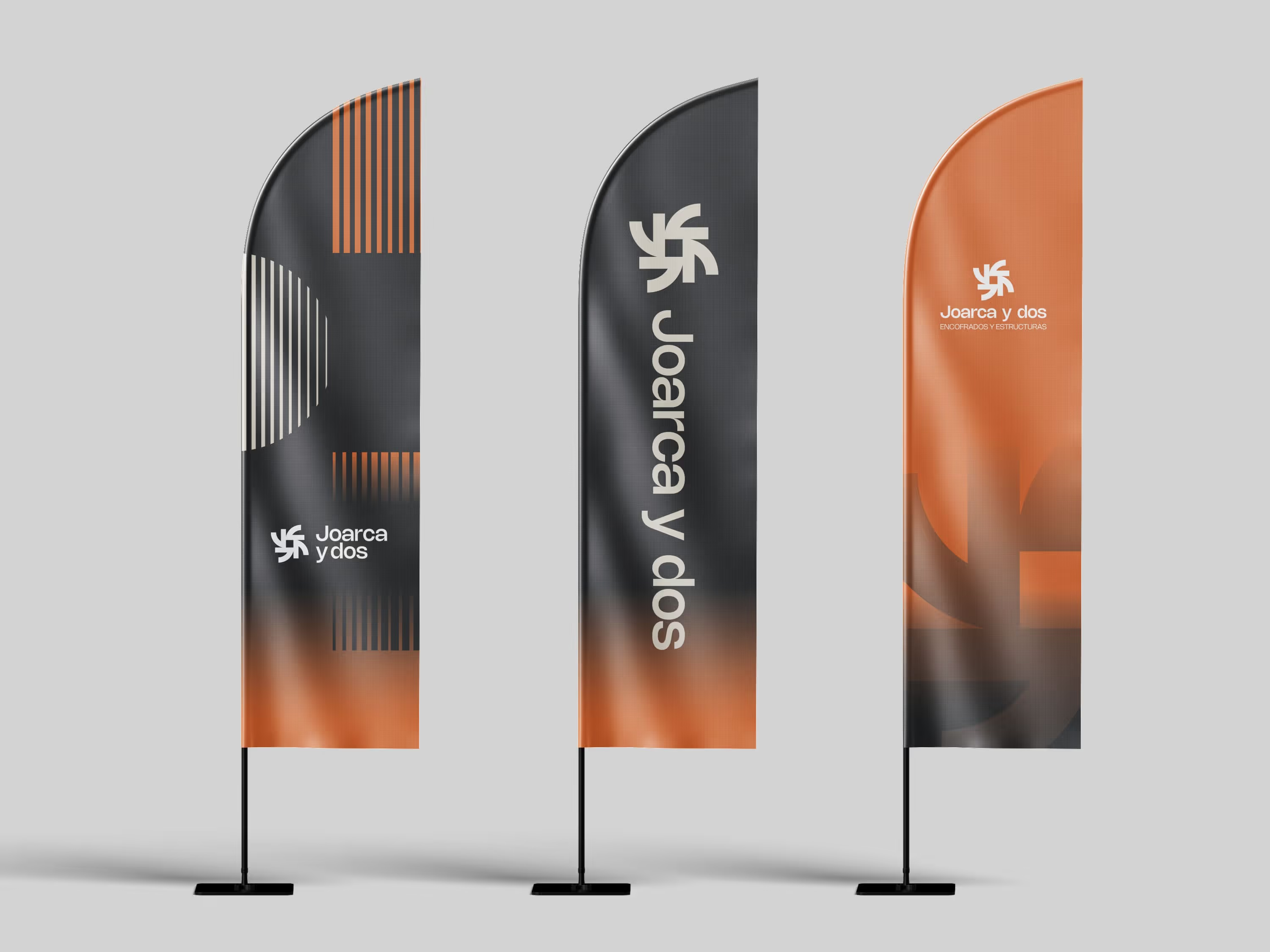
We developed a new visual identity that feels modern without losing professionalism, substantial without losing approachability, and solid without relying on predictable industry conventions. A cleaner, stronger and more recognisable brand, designed for building sites, sales materials, vehicles, uniforms, signage and every point of contact with clients, suppliers and teams.

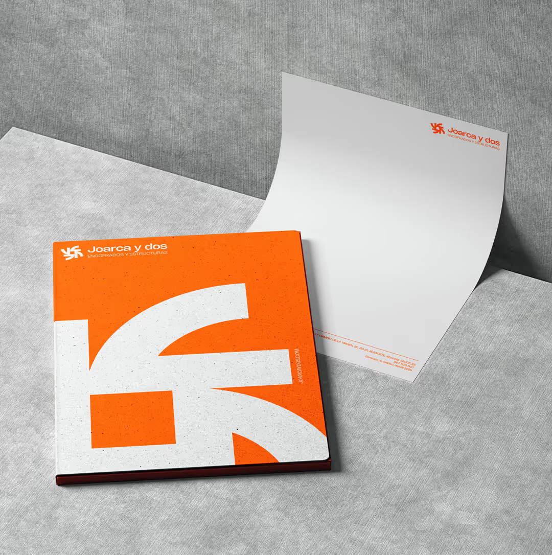
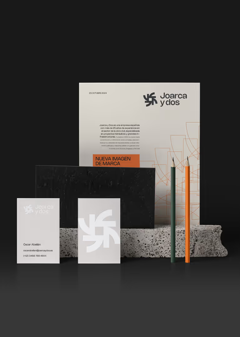
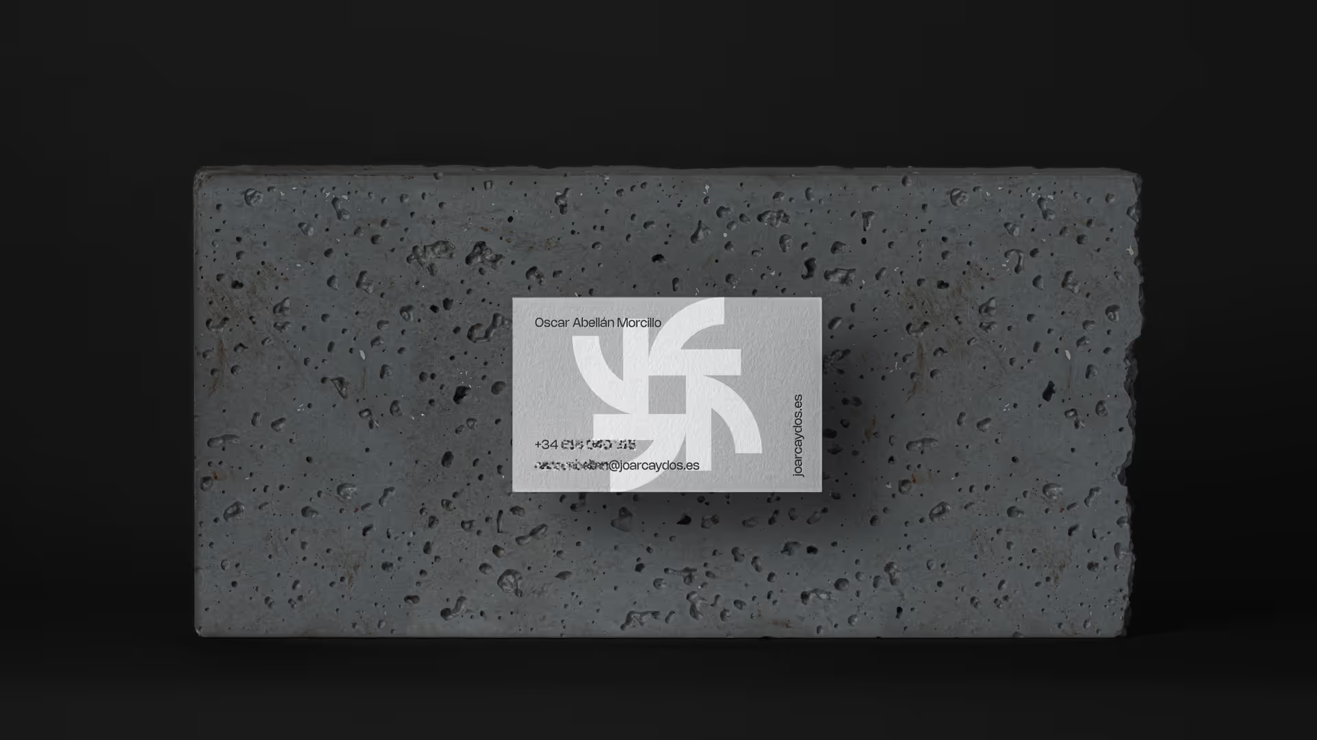
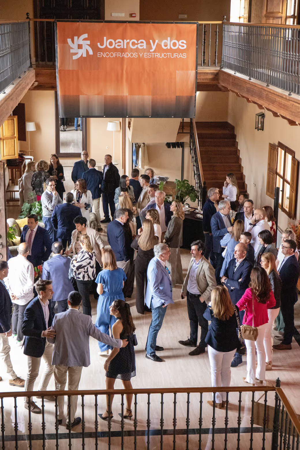
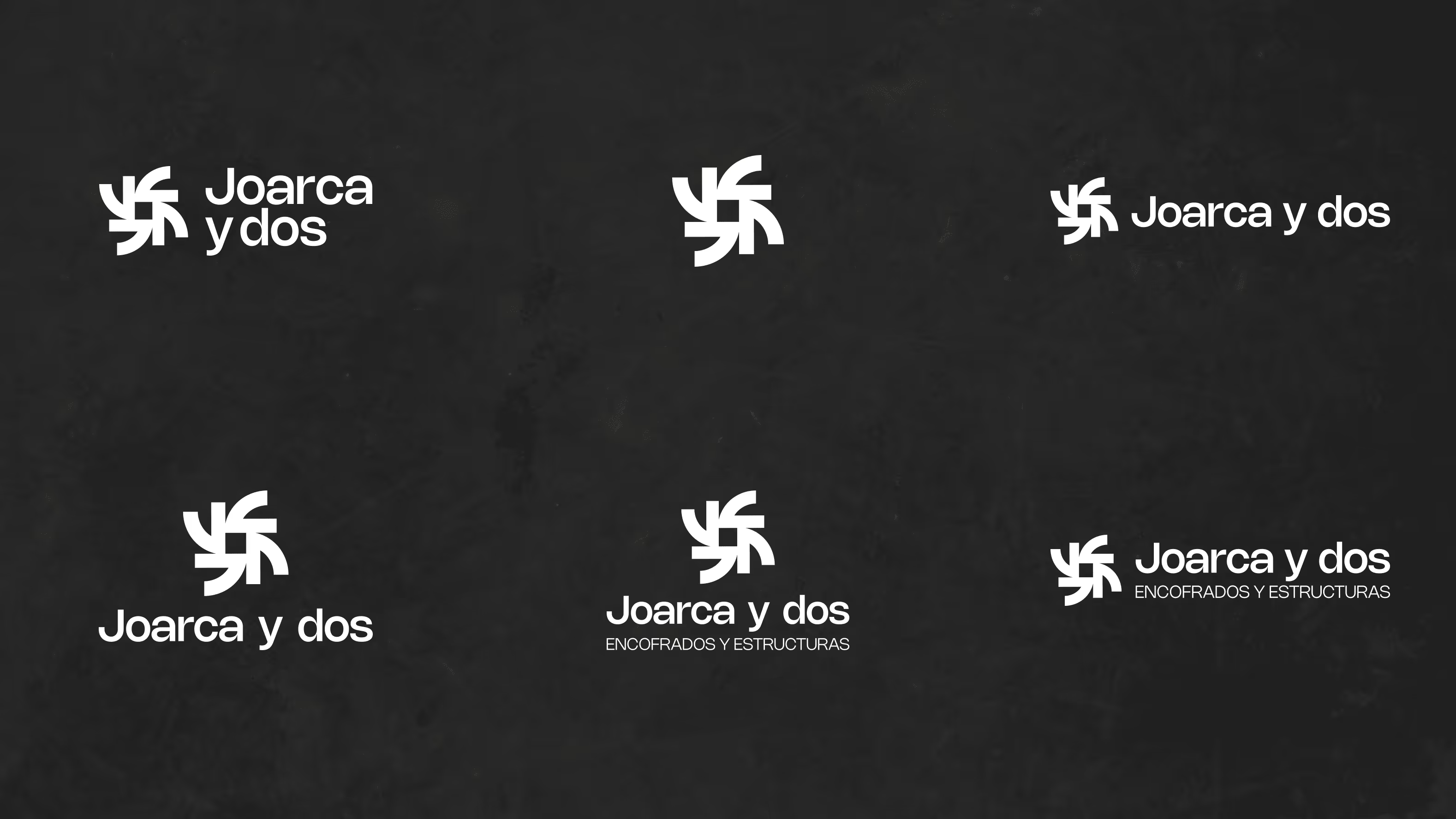
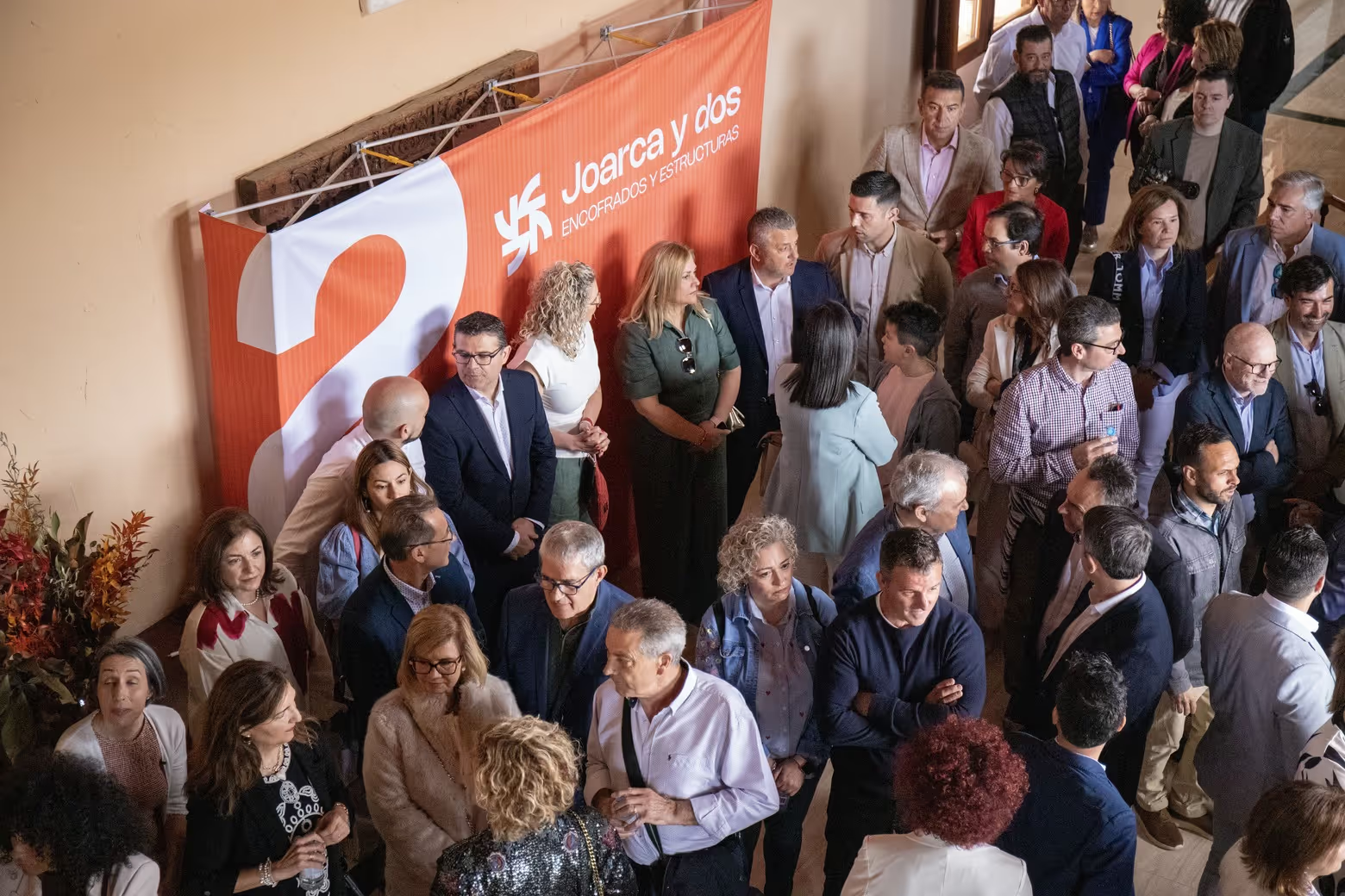
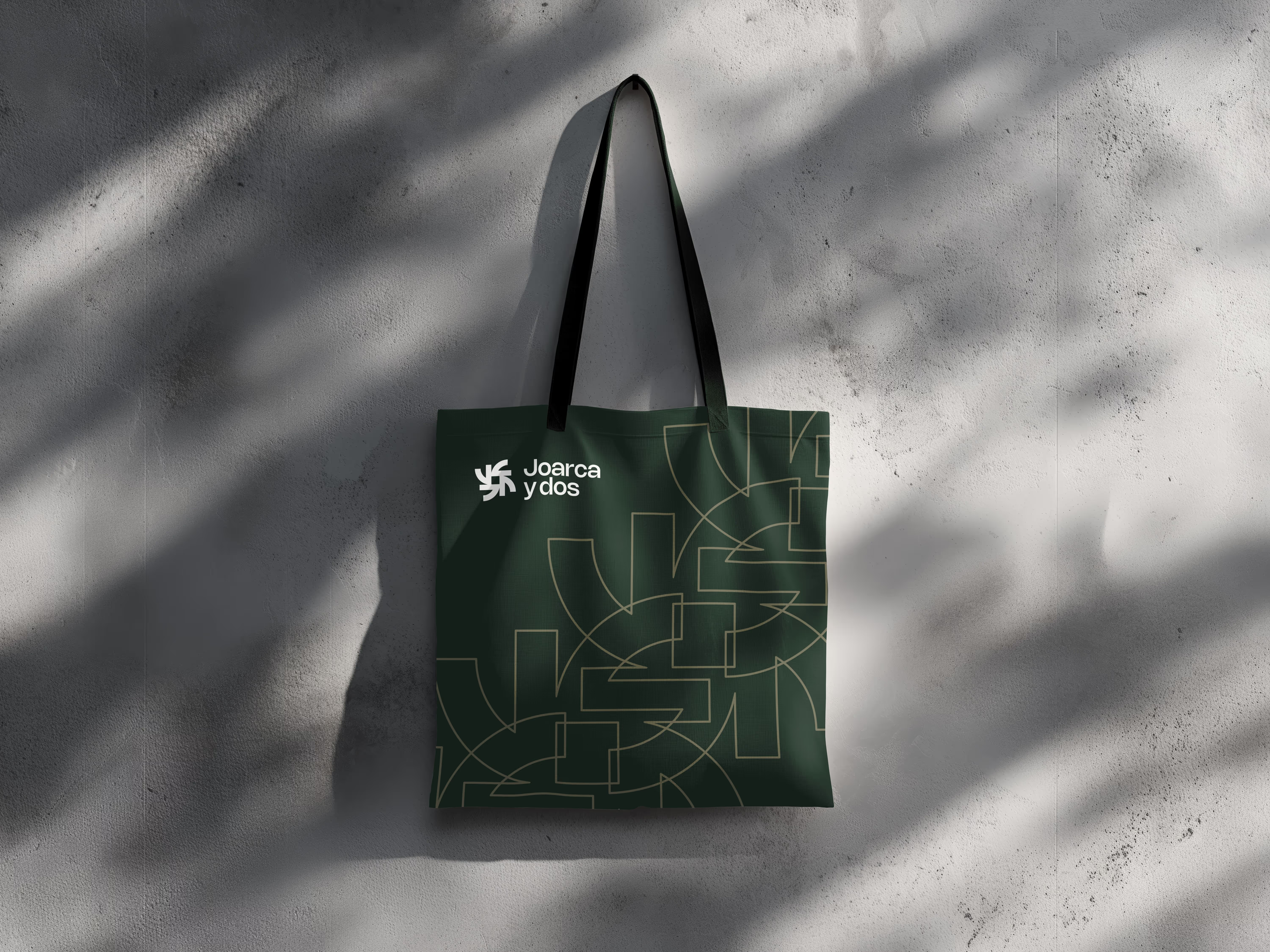
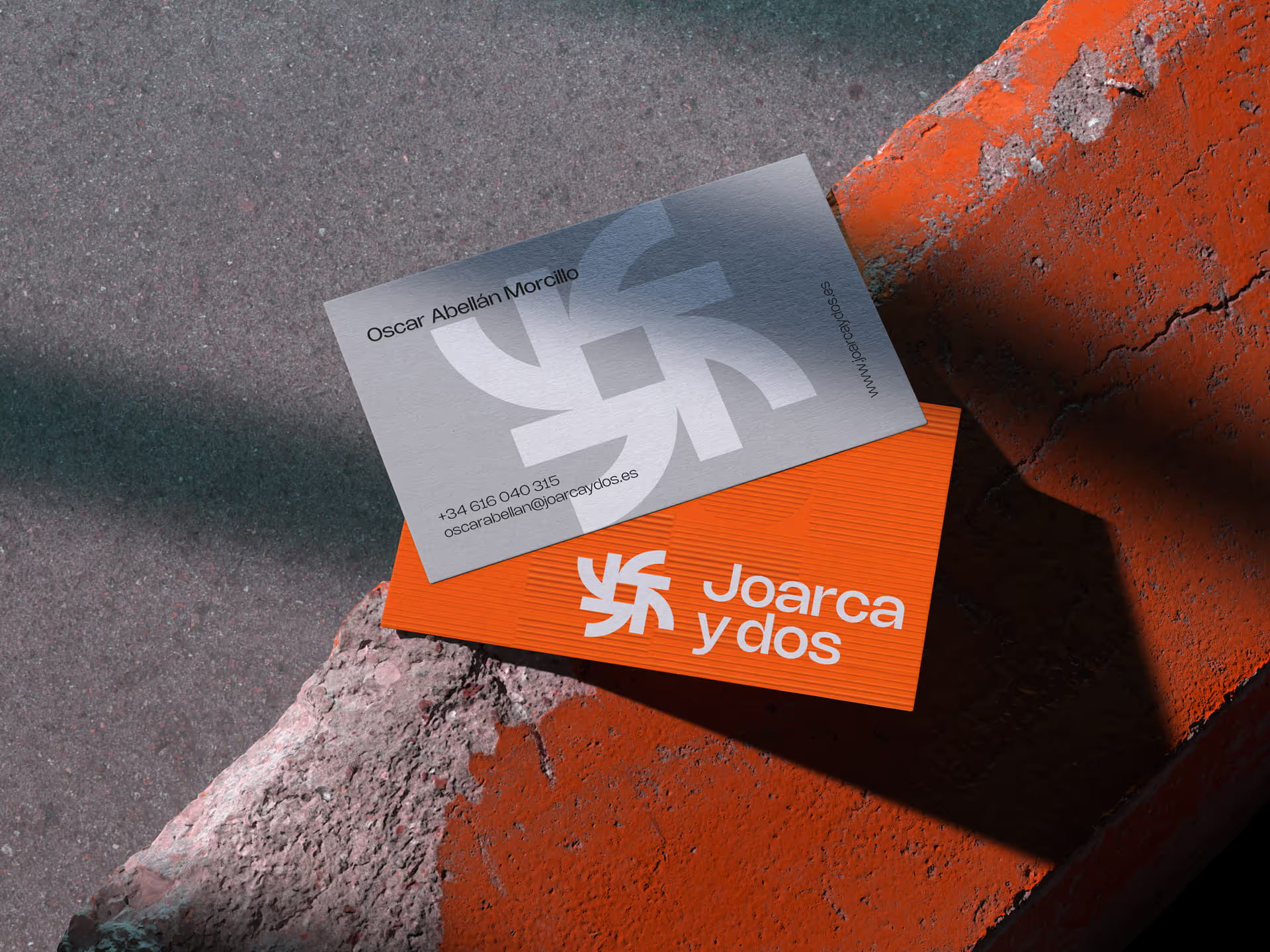
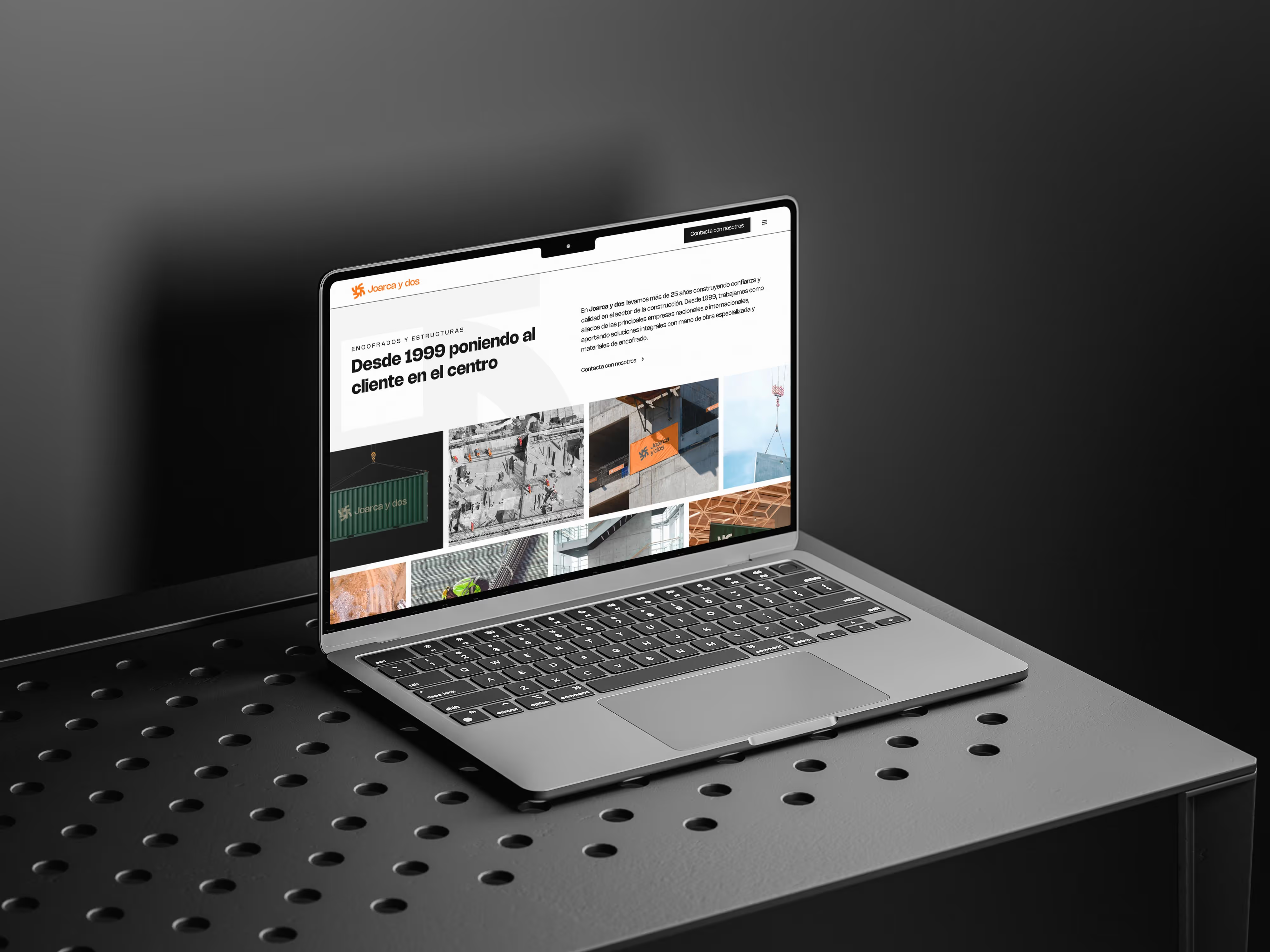
We built a complete visual system: logo, symbol, colour palette, typography, corporate applications, vehicles, workwear, stationery, presentations, website, sales brochure and everything needed for the 25th-anniversary event, where the new identity received an enthusiastic welcome.

The result was a stronger, more recognisable identity that better reflected the company Joarca y Dos already was, but whose capabilities were not always apparent from the outside.

A brand ready to move beyond a small or local image and take its place as a specialist, dependable company capable of delivering major projects nationwide.
client

challenge

Refresh the visual identity of a company with 25 years of experience in formwork and foundations, during a generational handover and with ambitions for greater national recognition. The challenge was not simply to modernise the brand, but to communicate the strength, safety and reliability already demonstrated in every project.

solution

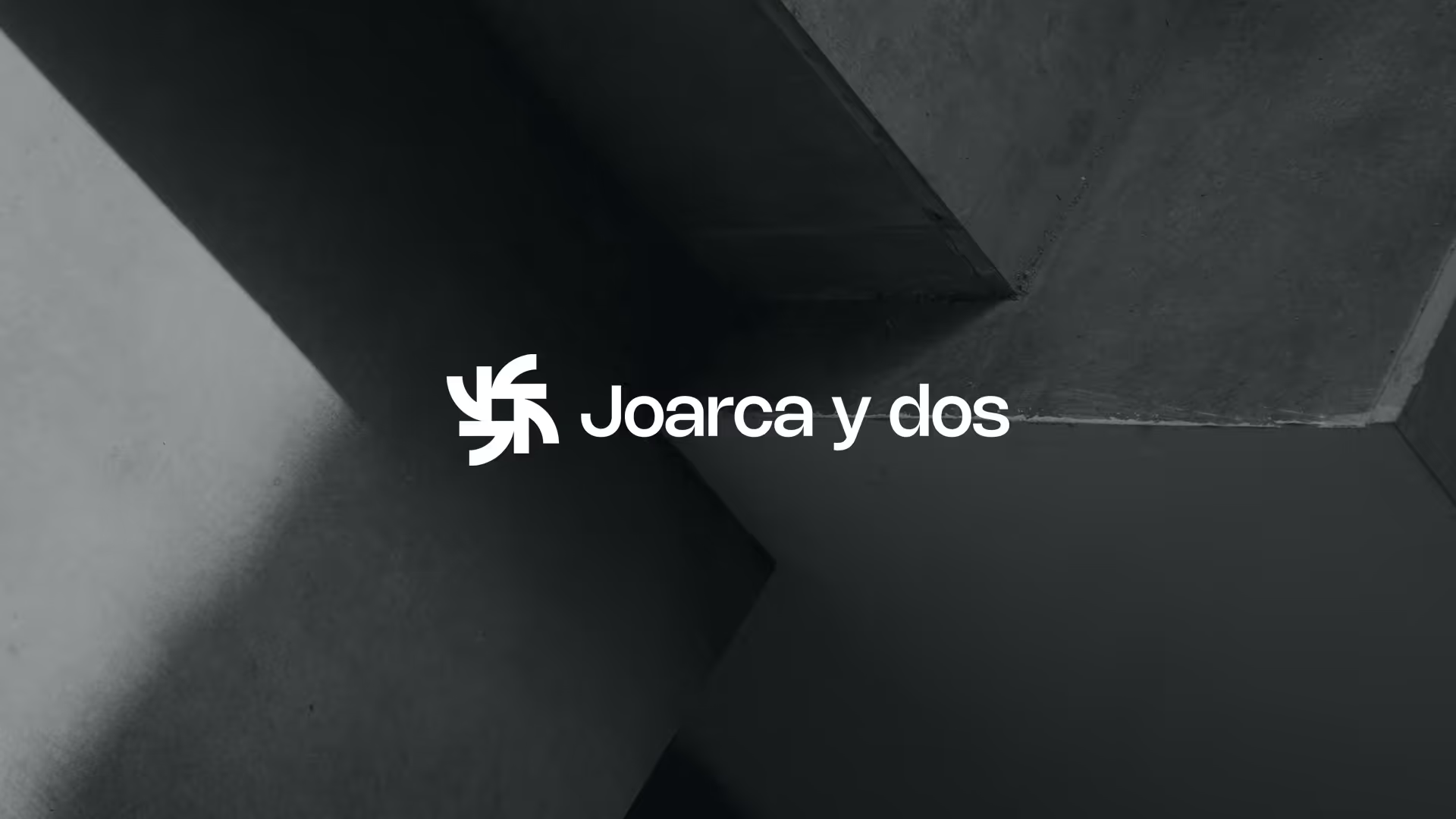
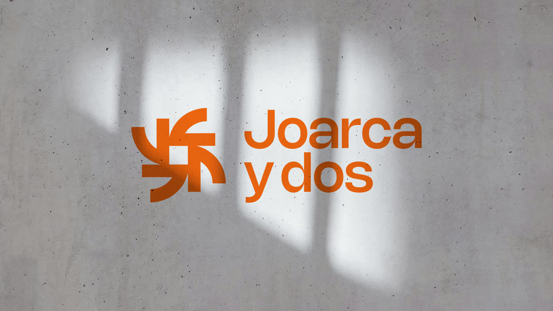
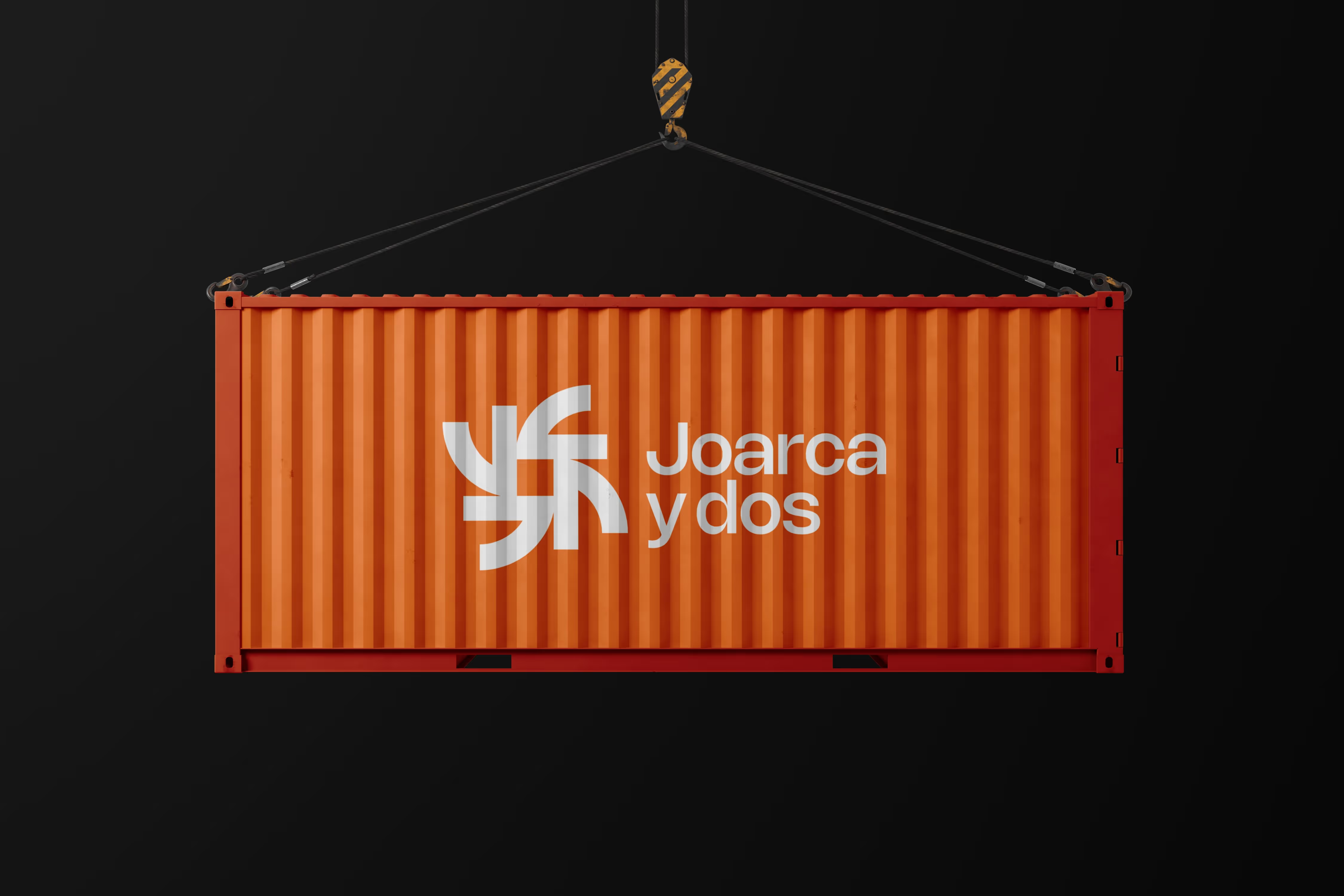
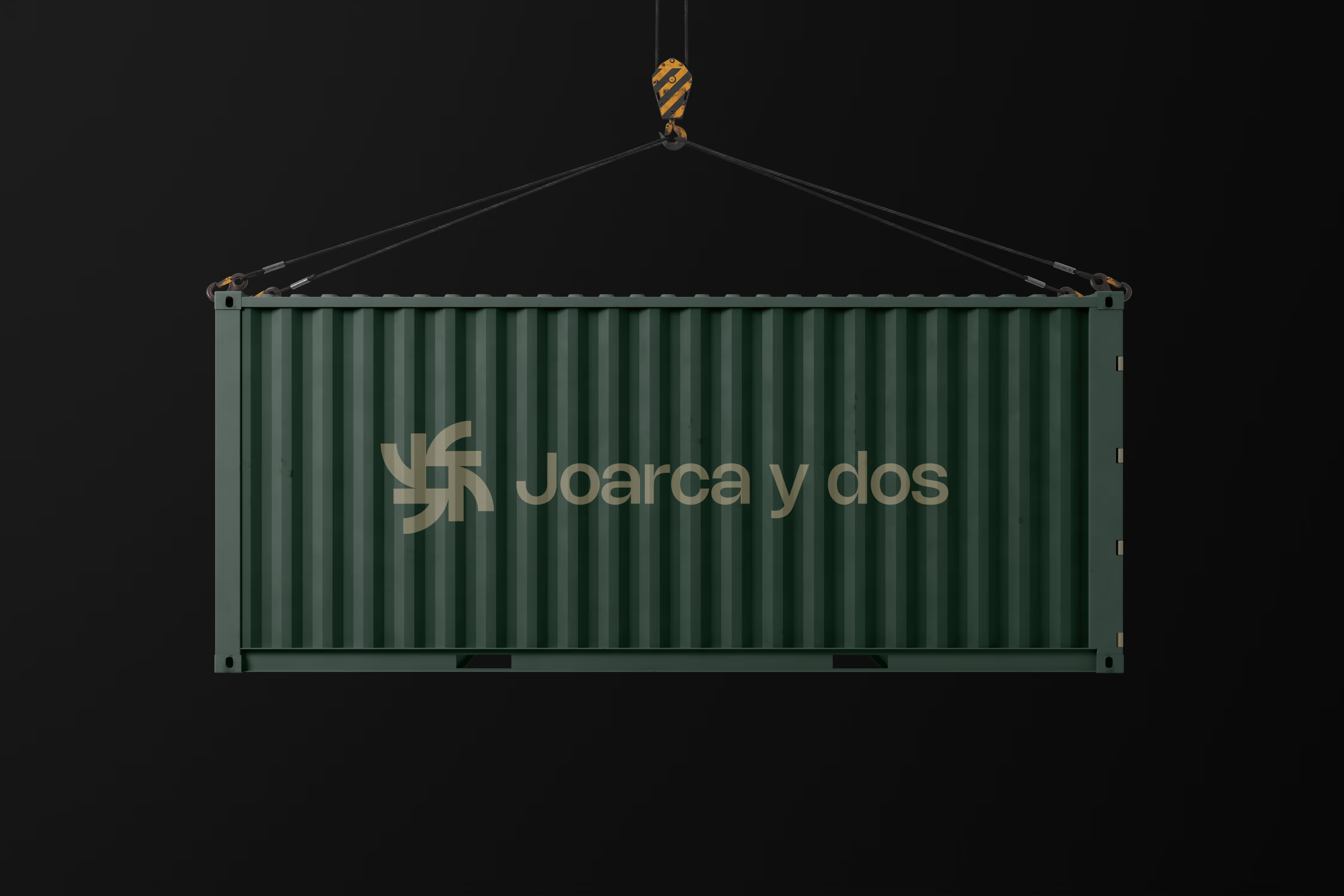
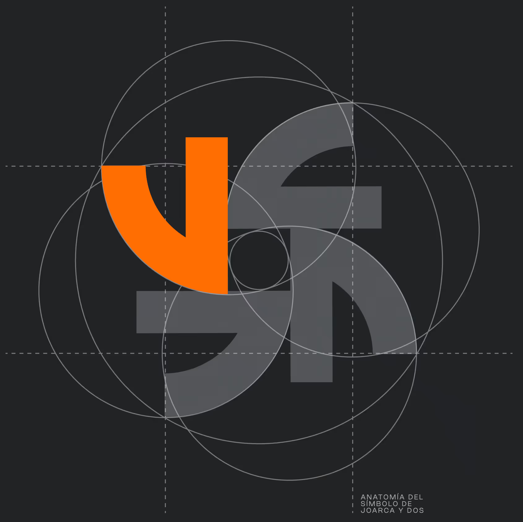
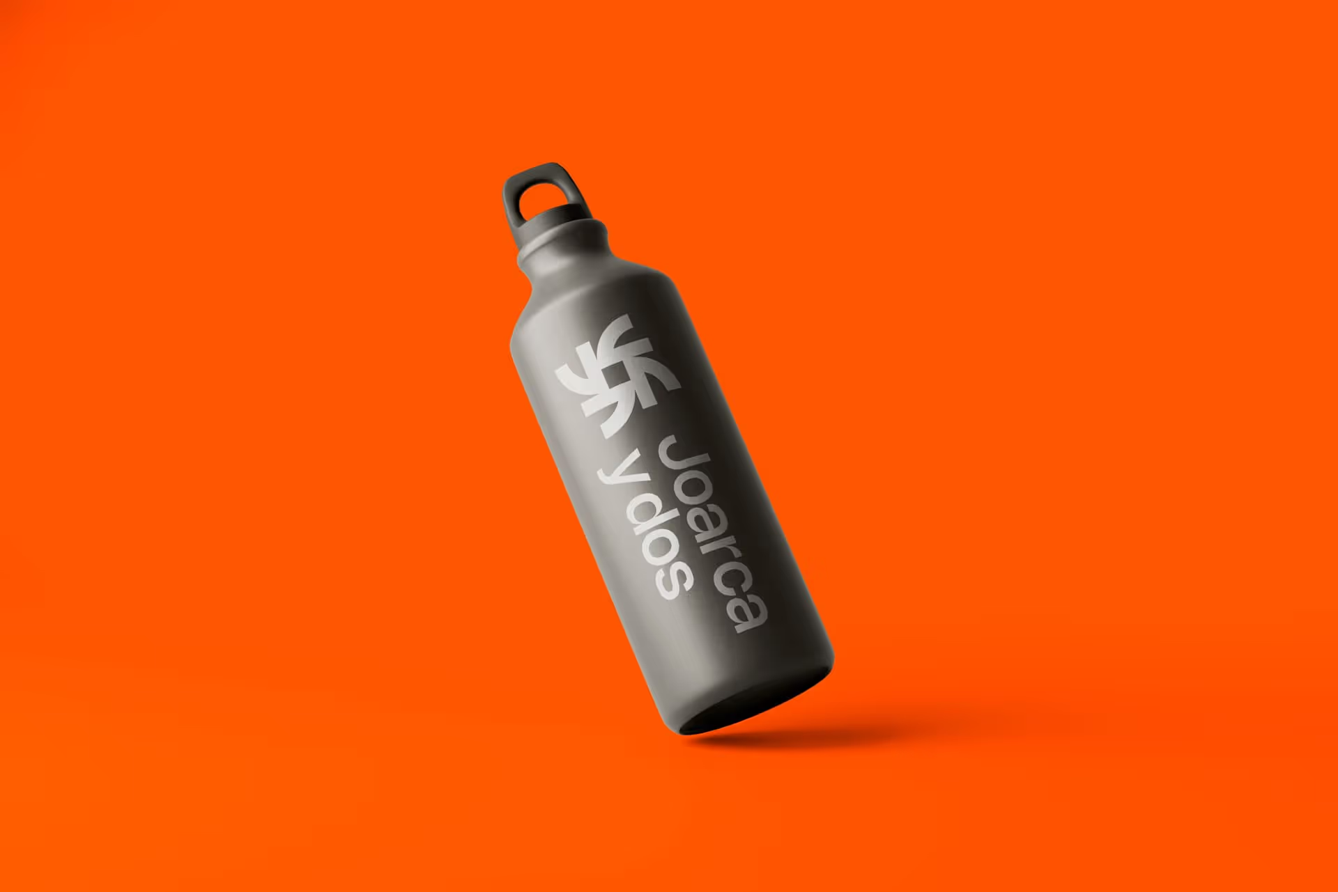
We created a visual identity around the J in Joarca, repeated to form a solid structure with a central opening that represents formwork: a space ready to be filled, built upon and turned into something bigger. From this concept we developed a complete brand system, including the logo, symbol, palette, typography, stationery, vehicles, uniforms, helmets, signage, presentations, website and sales brochure.

our role

Branding
Graphic Design
Web Design
Audiovisual production
Brand Refresh
UX/UI

Website mockup

a brand needs strong foundations to gain credibility and direction

No items found.

Explore our cases

From SMEs to public administrations, including banks, football teams, and educational institutions.
Show me more

A space of pride and passion

Branding
Brand strategy
Marketing
Graphic Design
Web Design
Take me to the case

From micro to macro

Branding
Brand Refresh
Web Design
Graphic Design
UX/UI
Take me to the case

Capture, entertain, convince

Branded content
Naming
Brand strategy
Audiovisual production
Campaigns
Take me to the case

GROW YOUR BUSINESS IN 2026

GROW YOUR BUSINESS IN 2026
Book a 30-min meeting
Pattterns is now Ocelot